Not The Same Old Grind
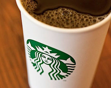
 Last week Starbucks unveiled a new logo, inciting strong, polarizing reactions across social media platforms. Unlike other recent rebranding disasters, such as the Gap and Tropicana, Starbucks’ new logo is a smart and elegant update that’s more of a evolution than a total redesign.
This is the fourth version of the logo, and the latest since the company went public in 1992. The friendlier new logo features a face-lift for the signature siren, now front and center and in all green. The most significant change, and the one probably sparking the most controversy, is the dropping of the words “Starbucks Coffee.” Although removing the name is a bold move, the Starbucks brand is powerful enough to move into the rarified air of such companies as Nike and Apple, whose iconic logos need no words for instant recognition.
Starbucks's president, Howard Schultz, says the "small but meaningful update" will "ensure we remain relevant" as Starbucks continues to expand globally and increasingly sells non-coffee merchandise.
Starbucks has always been an innovator in developing its brand experience and has carefully built one of the world’s strongest consumer following. As Starbucks’ continues to move into new markets and expand the number of diversified products it sells, the new simplistic and friendly mermaid logo is the perfect forward-looking face to represent the company.
The new logo will mark the 40th anniversary of the founding of the first store, in Seattle in 1971, and is due to roll out in March. Despite some backlash, as time goes by, more and more naysayers will hear the siren’s call and embrace the new logo. I seriously doubt anyone addicted to Starbucks would stop buying coffee because they don’t like the logo on the cup. ![]()
