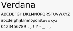
What's Your Type? Verdana Becomes a Masterpiece
 We all have our type and some stick to the same one no matter what. To many, that's a form of branding, and at CJP Communications we live, breathe and type by Verdana 10. Clean, simple and serif-free.
Not all are in love with this type, granted. But the Museum of Modern Art in New York on Monday admitted Verdana and 22 other digital typefaces to its architecture and design collection.
They will join Helvetica as the only other typeface in MoMA's collection. A little history (by way of an article in The New York Times): Matthew Carter was commissioned by Microsoft about 15 years ago to create an easy-reading font, one that was clear and crisp on a screen and on printed paper. The result - Verdana.
The genesis of why CJP chose Verdana is less clear. But it has supported our words through emails, memos and presentations for more than a decade.
Whether you are a Verdana fan or not, a simple, unifying practice such as a universal typeface can make all things seem in order at an agency, where creative juices and deadline pressures can hide behind text.
We all have our type: GE has Inspira and many others use Helvetica or Times Roman. And Verdana has its detractors as being to sterile or allowing function to follow form.
No matter the case, sticking to one's type can help produce a sense of style and unity. So congratulations, Verdana. And for the time being, serifs be damned! ![]()
