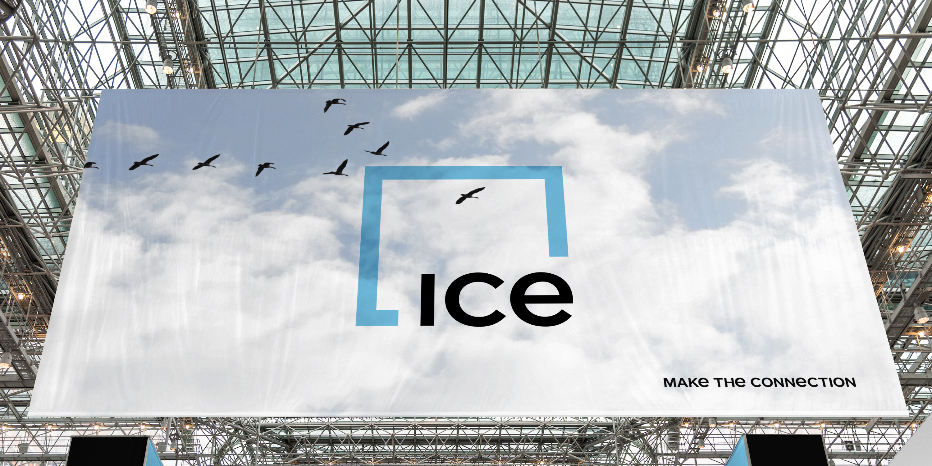
ICE Make The Connection
- Strategy
- Branding
- Advertising
- Brand Architecture
The Challenge
After decades of growth, acquisitions and expansion, Intercontinental Exchange wanted to seize the narrative, connect their business lines, and tell people not only what they do, but why it’s important.
The Solution
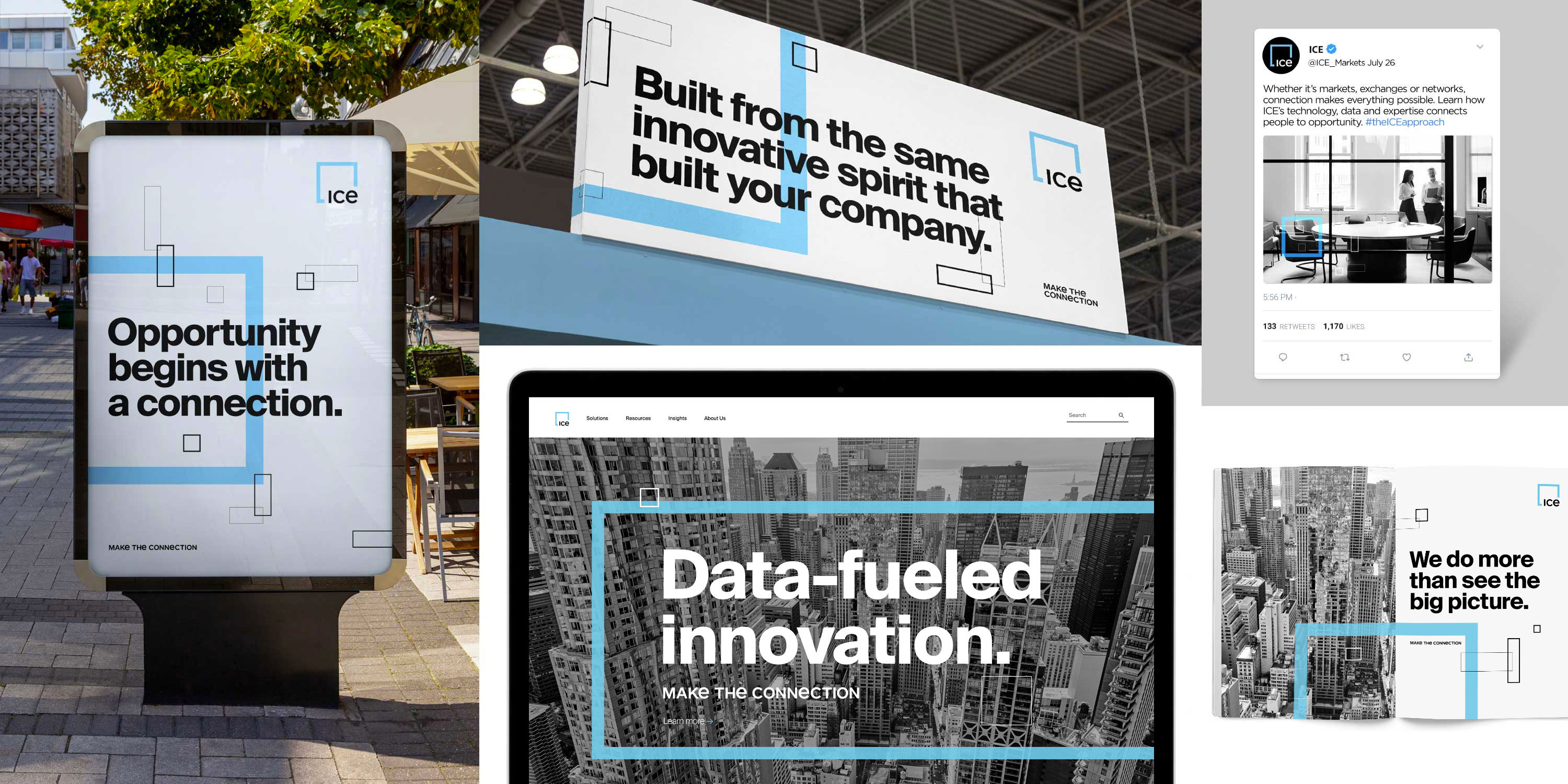
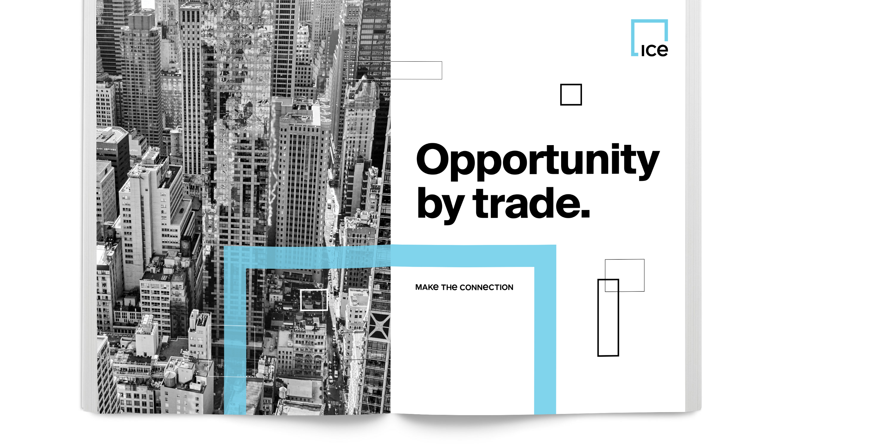
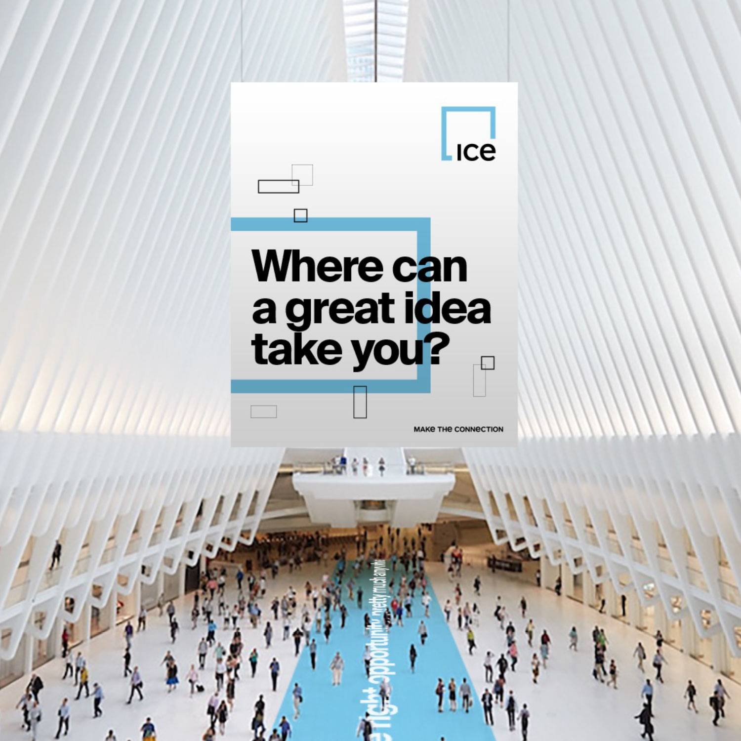
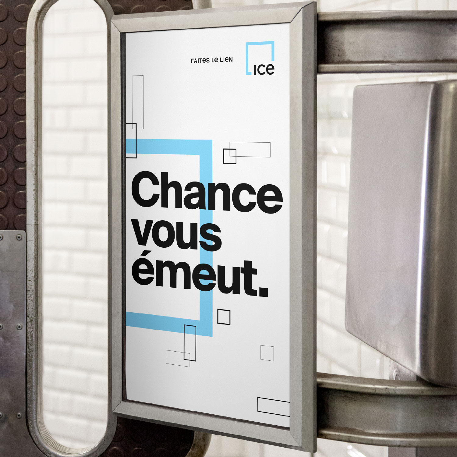
We updated their existing “Blue Square” identity and extended it as a through line that connects every component of ICE. Just as a cornerstone of a building is the strongest part of its foundation, we used a cornerstone of the square as the basis upon which a brand-new identity rests. We also created a custom font for the brand, with a lowercase “e” that further connects each business segment back to the parent brand.
The new identity came to life with the launch of a national advertising campaign featuring prominent connectors and influencers, along with the campaign line: “Make The Connection.”