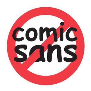
Fonts, Their Flavors and Why Comic Sans is Evil Incarnate
It was a dark and dismal computer screen on January 5th, 1995. People woke up, had their morning coffee, went to work and lived life in a happy, ignorant bliss of what was to come. Then, without warning, the pixelated display of a Windows 95 logo soaring over a blue-sky themed background burst into life. Excitement was abounding to a public wondering what innovations Microsoft would be introducing. Little did they know that the Pandora’s box in the guise of a Windows-based operating system would eventually be the death of all that is aesthetically pleasing in the world. For that day, my friends, Microsoft Bob was unveiled. Oh, what’s that? I’m sorry, you probably don’t recall Microsoft Bob, but that’s okay (there will be a pop quiz tomorrow). All you need to know is that it was with this application that the Font-Which-Must-Not-Be-Named was born. Curse you, Comic Sans. Oh, I’ve already said too much...
...But why stop now? My fate is already entwined in a timeless battle against a staunch, enduring and ugly foe. And while I’ve bravely armed myself to combat this treacherous foe, my defenses are not without limits. Bad typographic choices occasionally have a way of sneaking by with very ill-fated results. For example, July 8th, 2010 was a deeply unsettling day in for sports fans. There are those among us that may recall this as the day that LeBron James announced he would join the Miami Heat, and as such would be leaving the Cleveland Cavaliers. But the true anguish the sports world felt was not from LeBron’s decision, but instead because of the unfortunate letter written by the Cav’s majority owner, Dan Gilbert—in Comic Sans. 
All right, let the above example illustrate that there is a time and a place for any font’s usage. Welcome to Introduction to Fonts 101. Dan Gilbert’s letter, for example, would have been received far better had it been written in basic Helvetica. Let’s say you’re a teacher. Despite my herculean attempts to prevent it, I could acknowledge a classroom for young children is an acceptable place to use Comic Sans. Lost a kitten? Perhaps a sign using the font Impact for strong and loud results. Writing a ransom note? (Don’t involve me, please.) You may want to avoid the magazines, scissors and paper cuts; simply use a font conveniently and accurately named Ransom.
When would you NOT use the above fonts? I wouldn’t recommend a business proposal or official letter in Comic Sans (or anything else, for that matter). I would avoid using Impact almost all together due to its cliché and brazen nature—if you do use it, don’t overkill it. And if you were a teacher, I highly recommend you refrain from sending letters home to parents in the font Ransom. It might give parents an awkward impression of your intentions. Just saying.
Unfortunately, there has been at least one study finding positive features to Comic Sans, however I choose to define the results as pure blasphemy. Are you or someone you know and love a victim of Comic Sansing? Or, perhaps you’ve been living in infamy as a “Comic Sans Criminal.” And what about the hordes of other overused, cloned or unprofessional fonts? It’s okay; there’s help. If you're a do-it-yourselfer, just pay attention to the fonts you use and keep in mind that you WILL be judged on the choices you make. If you choose a lame font, people will think you're lame. (And, just because you think a font is hip, supafly and all that... well, trust me, it isn't. You just proved it.) Perhaps you need "professional help?" Depending on your psychosis, we may be interested in discussing our hourly rate for design... ![]()
