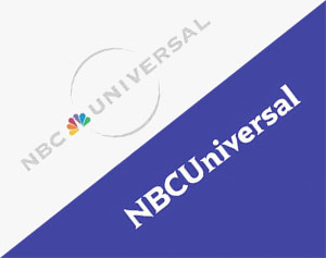
NBC's New Logo is Universally Anonymous
In a world where recognizable brands dominate our everyday wants and visions, there is the occasional company that dares to change their image. More often than not, these changes aren’t always met with fond results. Or perhaps just the negative responses are the loudest ones? That’s a psychological question I’m not entirely qualified to respond to, so I’ll table it in the rhetorical category. 
Just this past week, a 51% stake of NBCUniversal, Inc. (formally NBC Universal) was sold to Comcast, with the remaining 49% staying in the hands of GE. The purchase from Comcast resulted in the apparent need to rebrand the NBCUniversal, Inc., logo, with a unique staple missing – the highly recognizable and well-branded NBC peacock. The most glaring effect this logo has to a cynic, such as myself, is the complete removal of personality, which has been replaced by a faceless and arguably over-simplified appearance. While the new serif-loving logo is an obvious attempt to show the change of leadership, the overall usage and positive/negative ripple effect will not be known for some time.
NBCUniversal, Inc., is not the first well-known brand to change things up, however (nor will it be the last). In other recent news, coffee-lovers were stunned to see their dependable caffeine fix supplier, Starbucks, was bold enough to switch its logo up. The resulting change was the enlargement of the moderately voluptuous siren and removing the Starbucks title. This relatively subtle change stirred up a rather loud outcry from customers. A multitude of devoted patrons claimed they would switch brands all together. Go ahead, Google it. 
In yet another example, before the world as we know it was covered by vast blankets of snow, slush and ice dams, another brand-based theatrical event unfolded involving the Gap, a well-known clothing retailer. Who can forget all the enchanting outrage surrounding the Gap’s brutal failure of a logo update? The new, now rejected, logo removed the outer blue box and opted for a more simplified look. The proverbial seismic tremors from the change were so strong that Marka Hansen, the executive in charge of the change, resigned on February 1, 2010. Ouch.
Why do these sometimes seemingly harmless aesthetic changes affect people so passionately, and why is NBCUniversal, Inc., brave enough, perhaps naively, to take a similar risk? Familiarity and continuity are generally the ideal choice for people – and why not? Change can be intimidating. Perhaps there are other modern factors that having made the world more dangerous for rebranding, such as the ebb and flow of social networking and the snowball effect one person can make. One thing can be said for sure: changing a recognized brand is increasingly more of a risk as time passes. NBCUniversal, Inc., took a leap of faith with its brand revisions – perhaps since it’s not a consumer product company, it will be immune to the mass hysteria we’ve become used to. Stay tuned, and keep your riot gear at arm’s length. ![]()
