Rebrand Alert: Quaker Oats's "Larry" Gets a Makeover
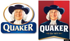
 In what I would describe as an epic fail, it just recently came to my attention that PepsiCo-owned Quaker Oats went through a bit of a rebrand (as seen to the right, thanks to Huffington Post). It saddens me that I apparently required several weeks to even hear about this story, but I’m on top of it now so everyone can breathe a collective sigh of relief. Everyone all sighed out and refreshed? Great. As some people more astute than myself might know, PepsiCo is no stranger to bravely attempting to spruce up its many recognizable brands. All of these attempts, however, didn’t conclude with the reward of an oft-desired gold star sticker. (And no, there weren’t any scratch-and-sniff stickers either—do they still make those? And who can find me some?) If you want to take a stroll down memory lane, take a look at the relatively recent nightmarish Tropicana rebrand and the company’s awkward loss of sales.
Did you know people in-the-know call the Quaker Oats dude “Larry?” Yeah, I didn’t realize he was part of the stooge gang either, but I guess I’m less of an intellectual than most. Due to his Amish appearance, I expected him to be named Solomon, Jedediah or perhaps Butch. For those of you at home keeping track, the lesson learned here is that life is full of surprises. But alas, Larry was feeling a bit frumpy in his old age and decided it was time for some change we could believe in. Plus, why would someone have a double chin after years of pimping all of that oatmeal? Clearly something was amiss there. So, after several weeks at the gym, our boy Larry shed a few pounds and bestowed his skin with a healthy, youthful gleam reminiscent of a man in his early forties wearing a highly stylish, slightly shorter white wig (when compared to his previous incarnations). Holy founding fathers, Batman!
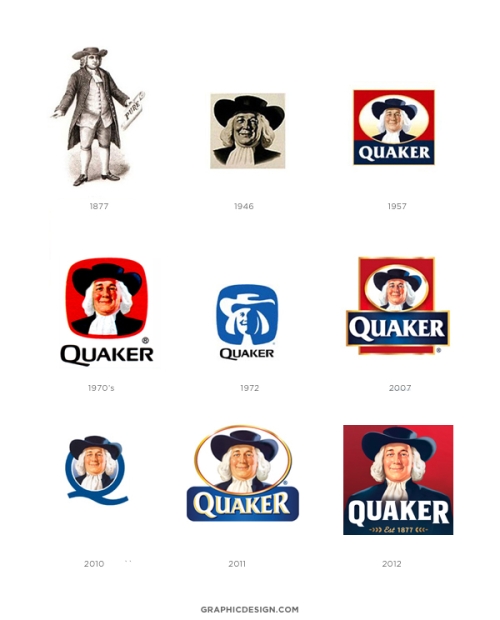
On top of the basic changes to his face and hair, Larry is now sporting a very dapper pair of shoulders and implied arms, that were, until now, a mere myth (unless you count an earlier version of himself from the 1800s, seen below). Also gone is the halo shape that has contained Larry for many, many years, allowing him just a little more freedom to roam your favorite oatmeal box. The typography is also bolder and cleaner while retaining a slight serif, moving away from the previous embossed appearance.
All in all, the new logo contains a series of subtle changes that don’t seem to hurt the brand. People will still walk by store shelves knowing exactly what they’re shopping for. His physical features won’t confuse shoppers, and it’s quite possible most people won’t even notice the change. And hey, if a mascot can slim down and get his sexy on, why can’t we by downing some Quaker goodness? The new and improved Larry has the potential to help further the brand’s health benefits while maintaining its old-school charm. Despite being simple, I give a grade of A.
Take a look at the below timeline as seen on graphicdesign.com to see a collection of Larry’s evolutions over his lifespan.

What do you think? Do you like Larry’s new look? Or would you have done it differently? ![]()
